1958 Power
The challenge
Build an approachable identity for an Arizona solar company focused on making solar understandable and accessible to homeowners.
The approach
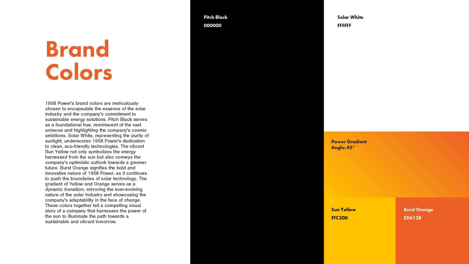
Black and white establish a clear foundation, with yellow and orange adding warmth and energy. Futura PT and Nimbus Sans balance a modern visual character with readable supporting information.
The result
A coordinated logo, color palette, typography system, and website design. The project gives 1958 Power a consistent visual language for explaining its services and introducing the business to prospective customers.
Services :
Logo Design
Brand Mark Creation
Color Palette Development
Typography Selection
Brand Package Delivery
Website