BRETON GARDENS FAMILY DENTISTRY
A family dental practice in Kentwood, Michigan, with decades of reputation built patient by patient, and a brand that hadn't caught up to it.
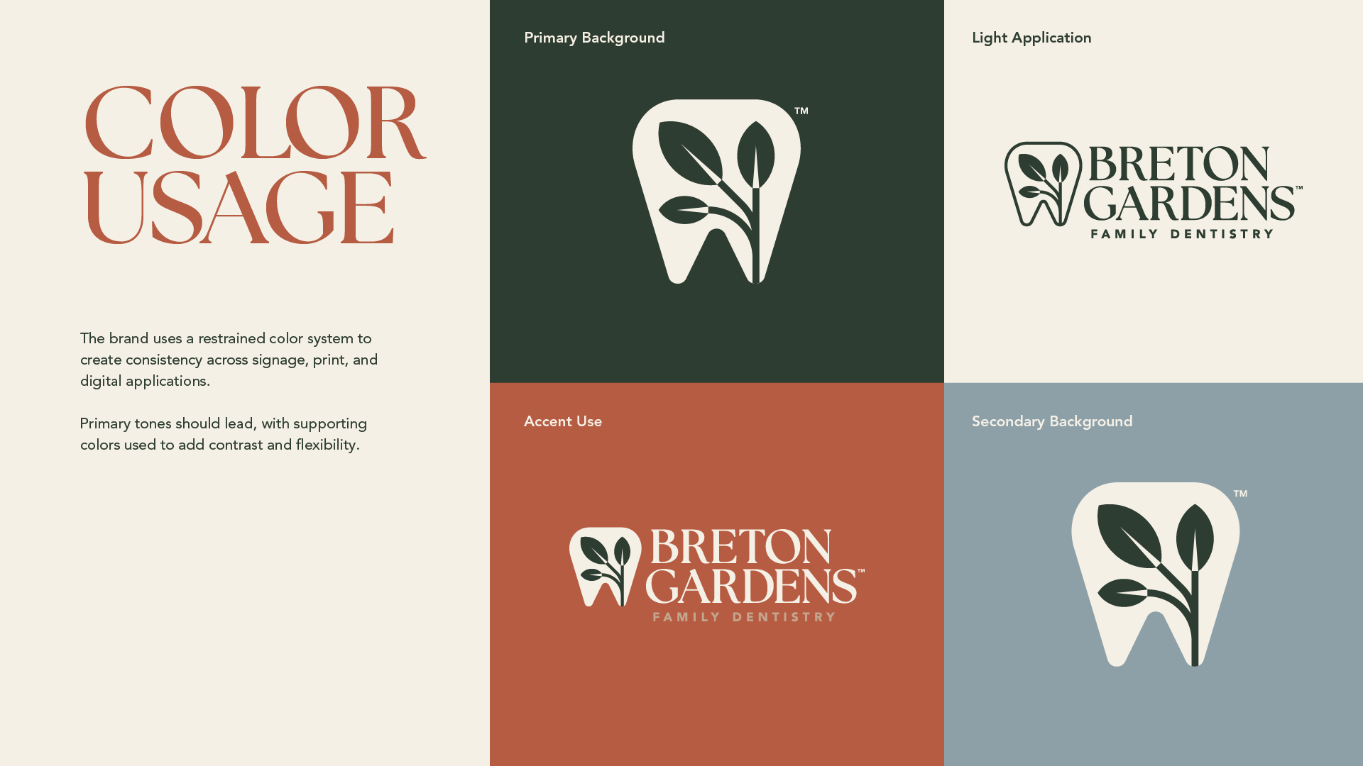
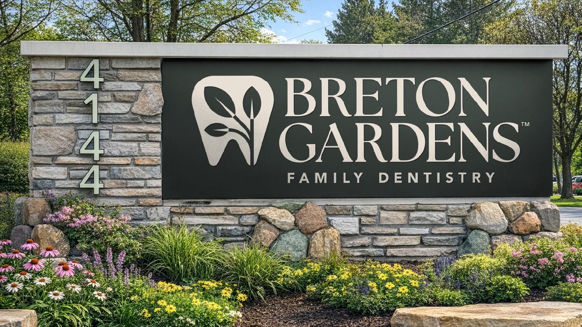
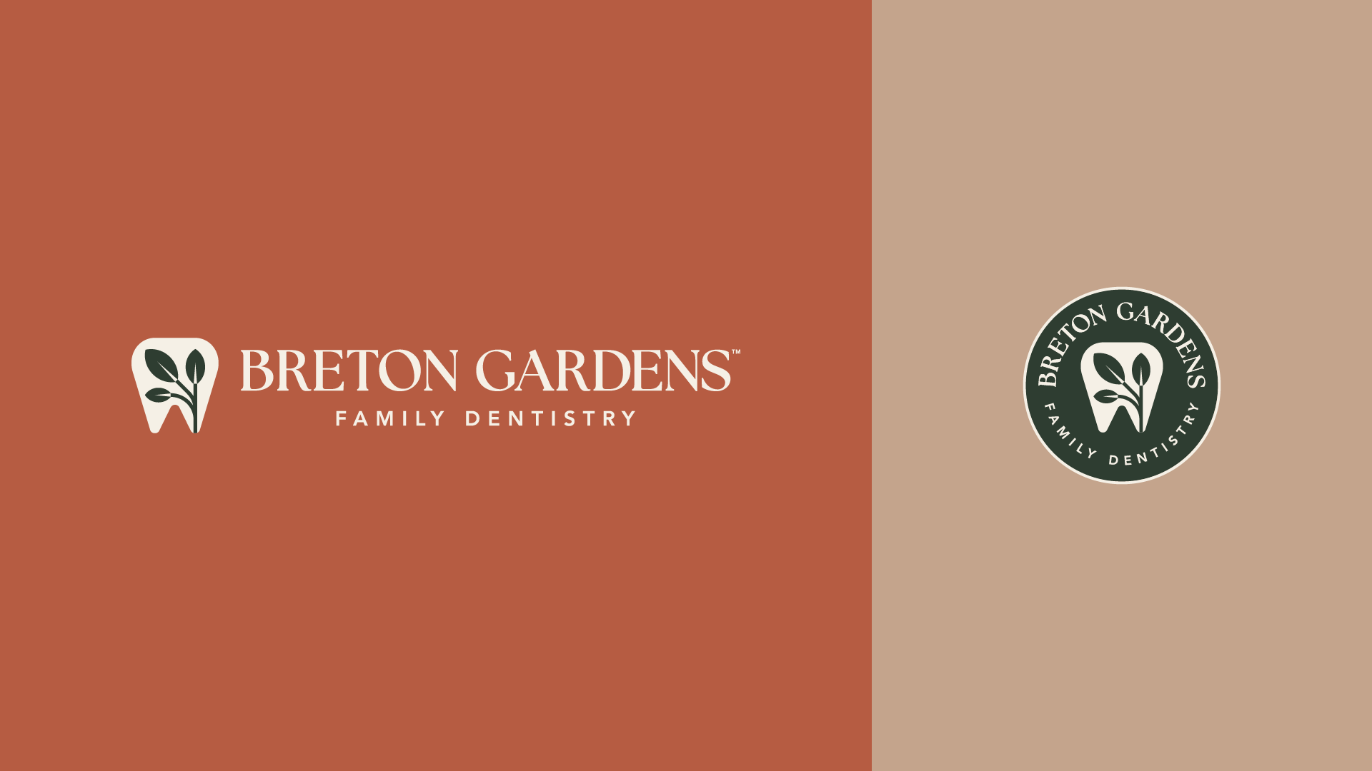
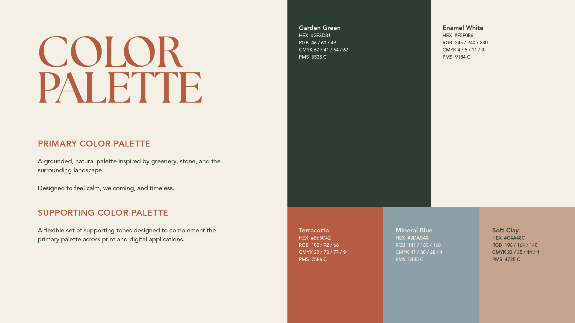
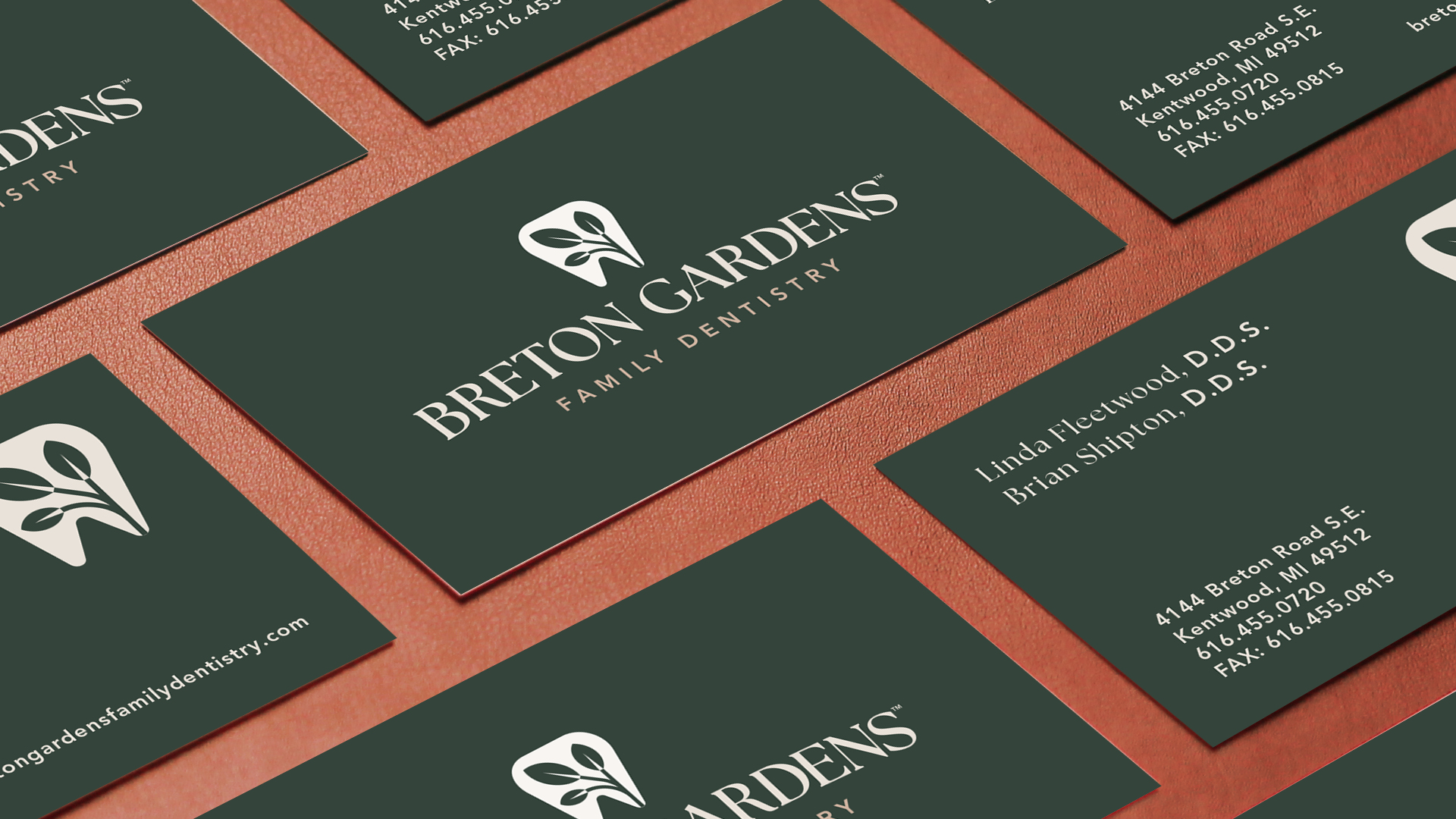
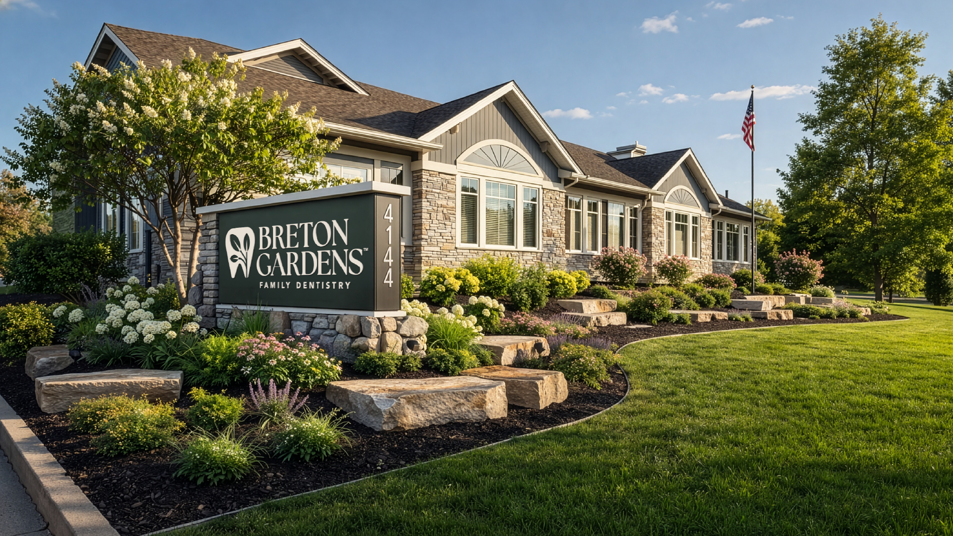
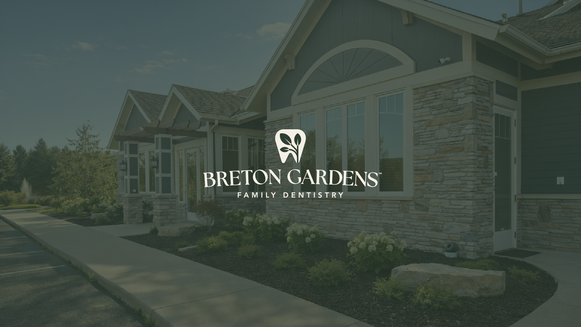
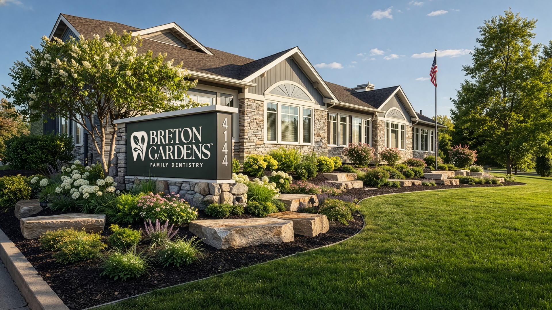
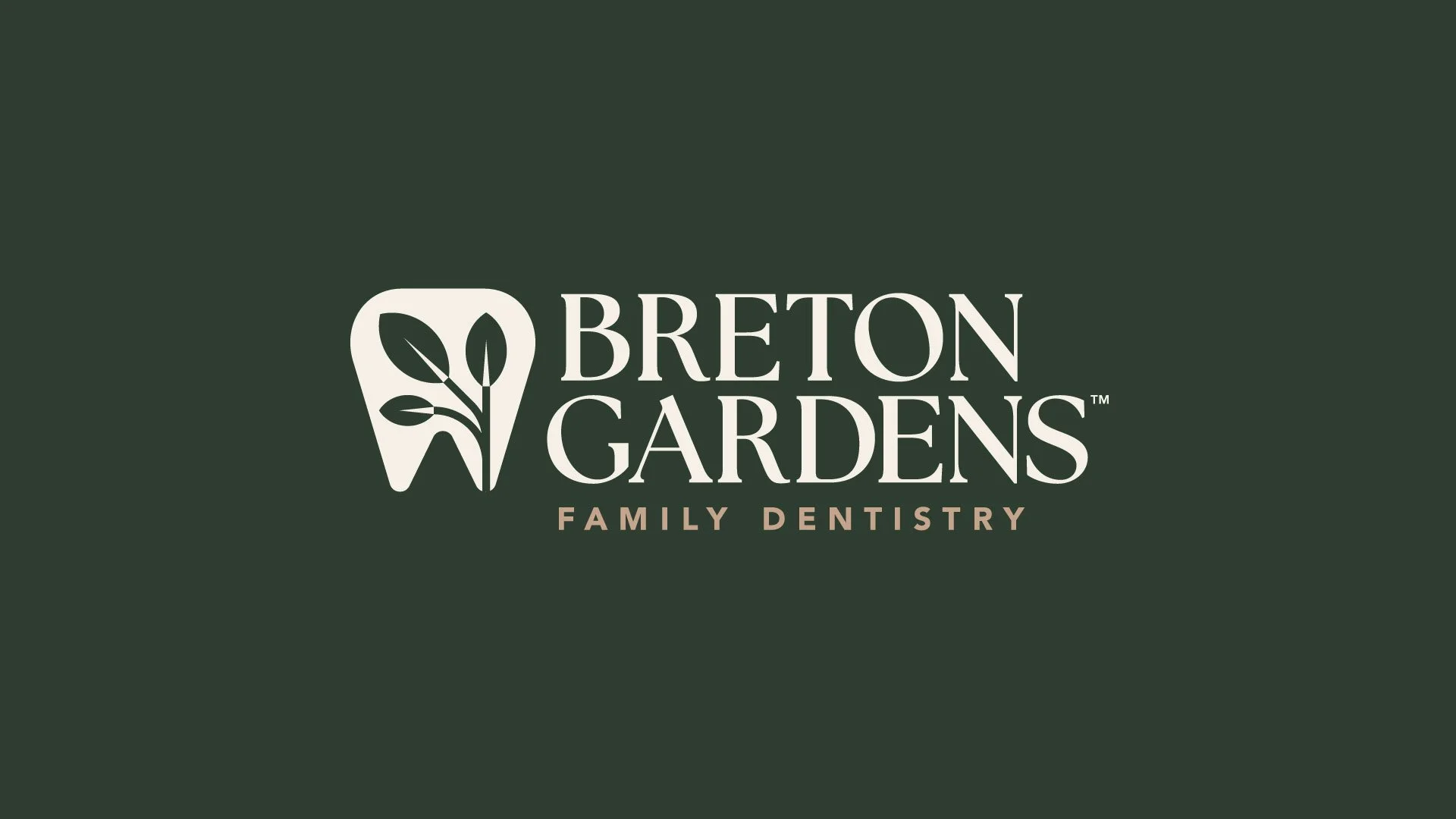
I drew a tooth with a sprout growing inside it, so the mark does what the practice does: care that compounds over time. Garden Green and Enamel White anchor the system, with terracotta, mineral blue, and soft clay giving it room across signage, print, and patient touchpoints. A serif wordmark keeps it warm, where most dental branding goes clinical and cold. The result: a practice that reads calm and easy to trust from the monument sign forward.
Services:
LOGO DESIGN
VISUAL IDENTITY
CUSTOM ICON
COLOR SYSTEM
TYPOGRAPHY
SIGNAGE
PRINT COLLATERAL
CREATIVE DIRECTION