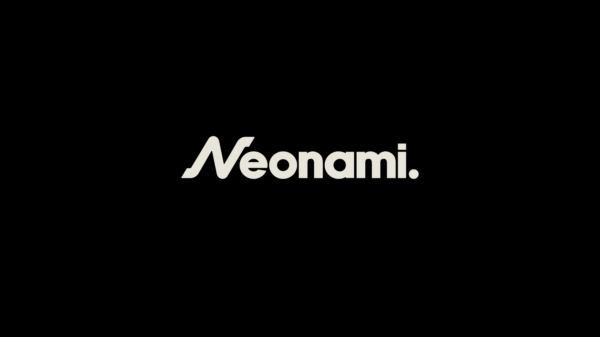
NEONAMI
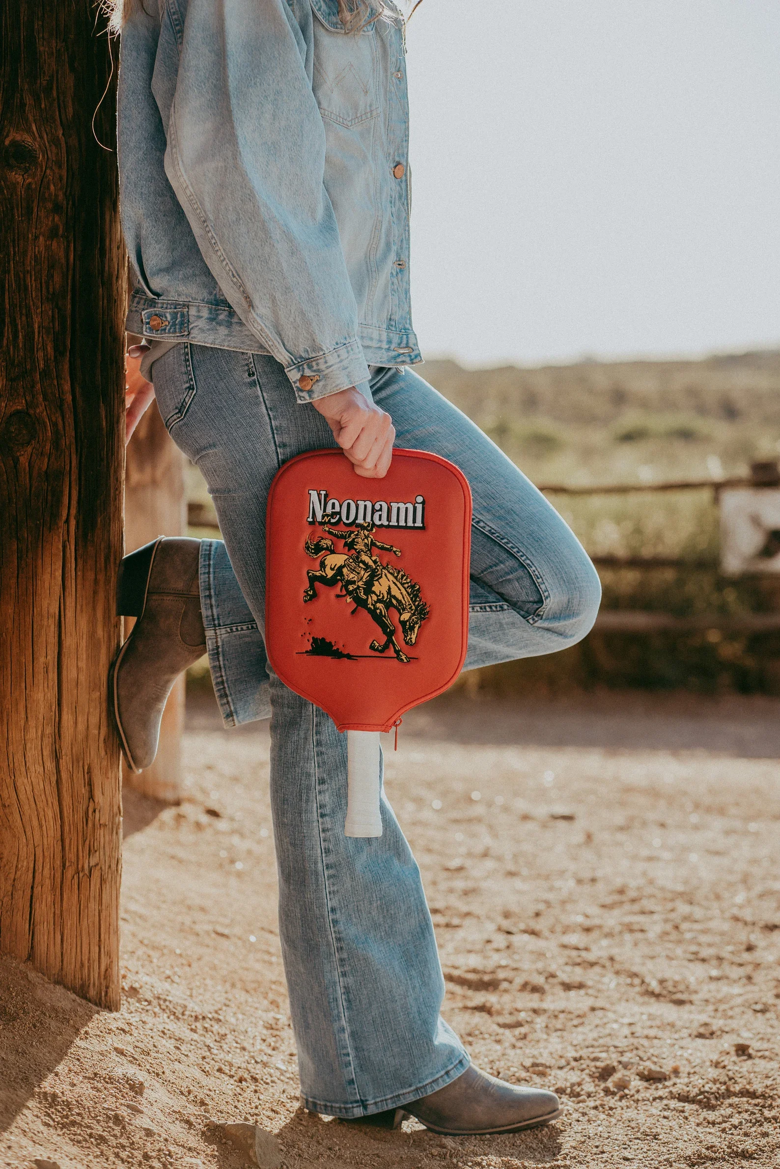
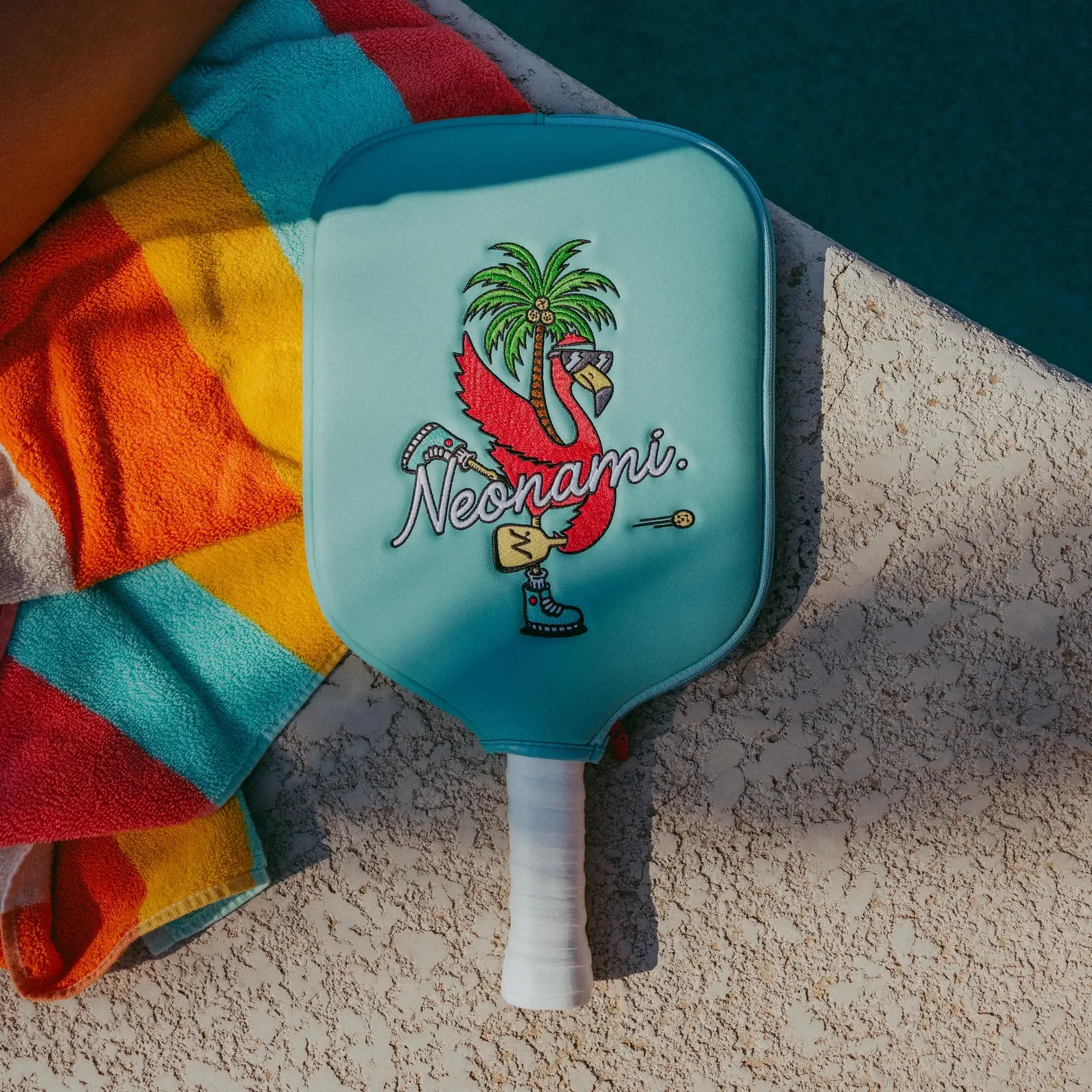
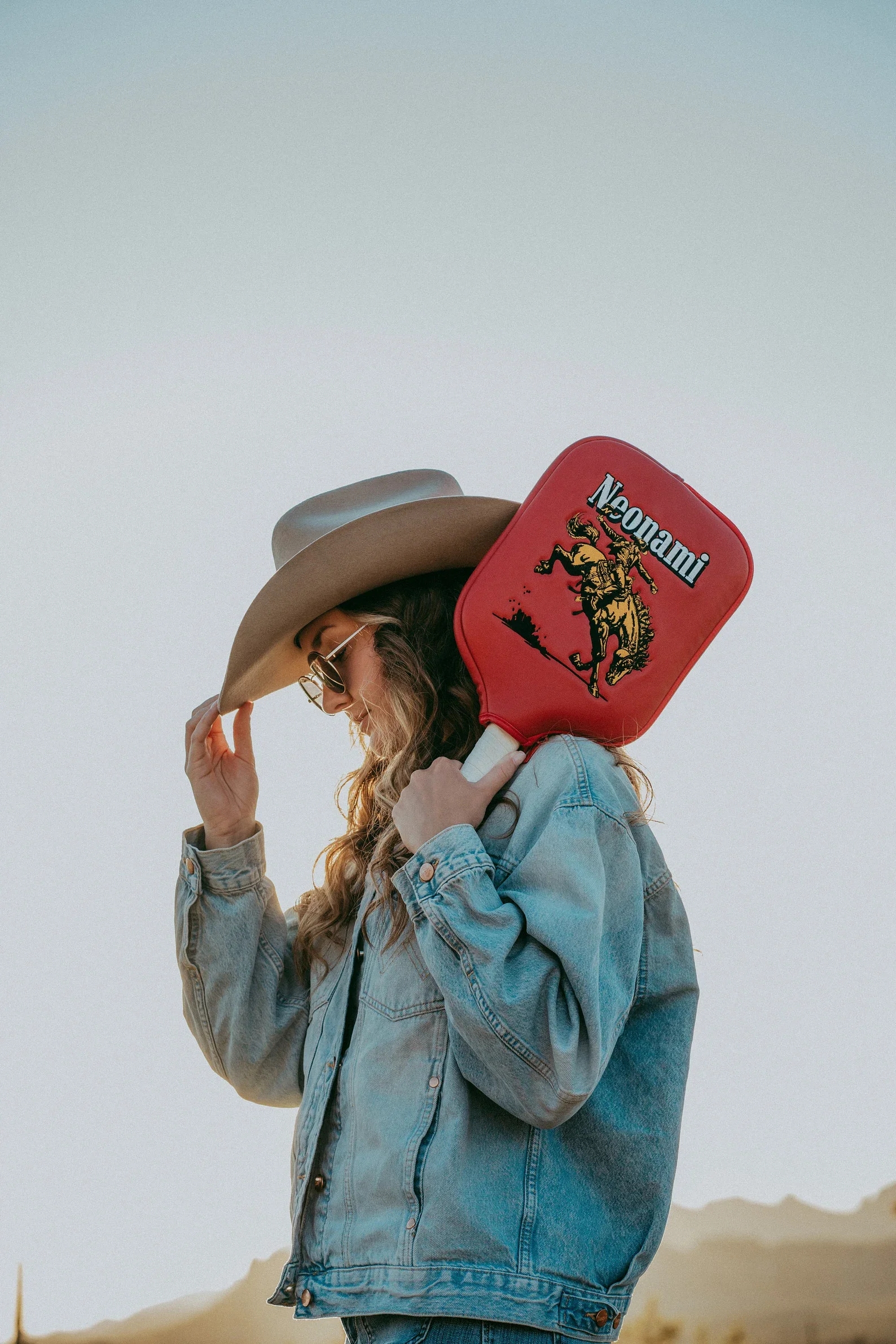
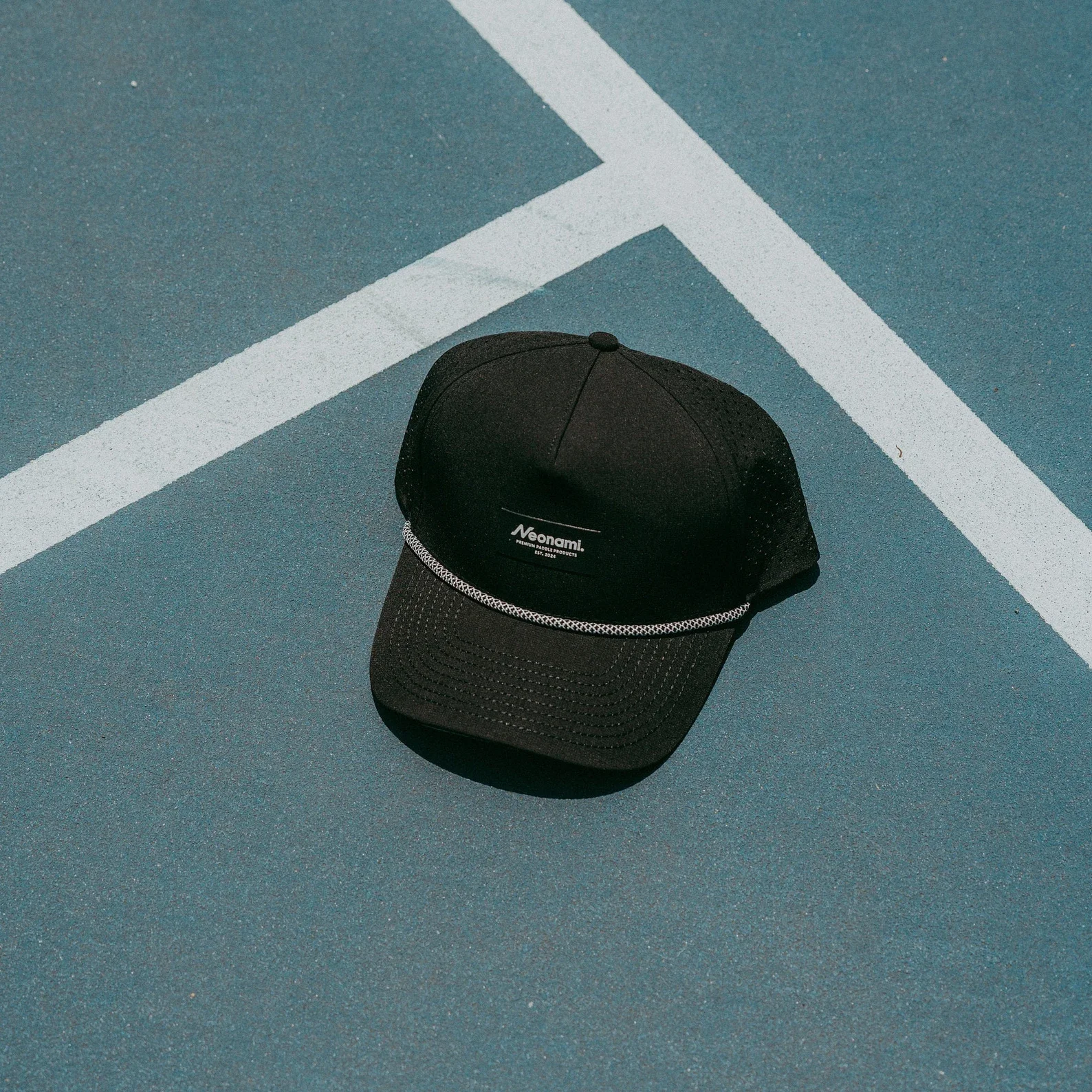
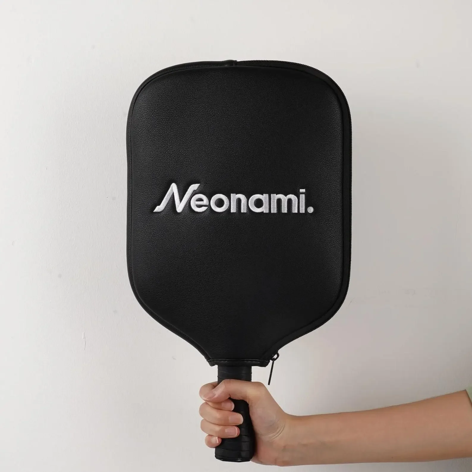
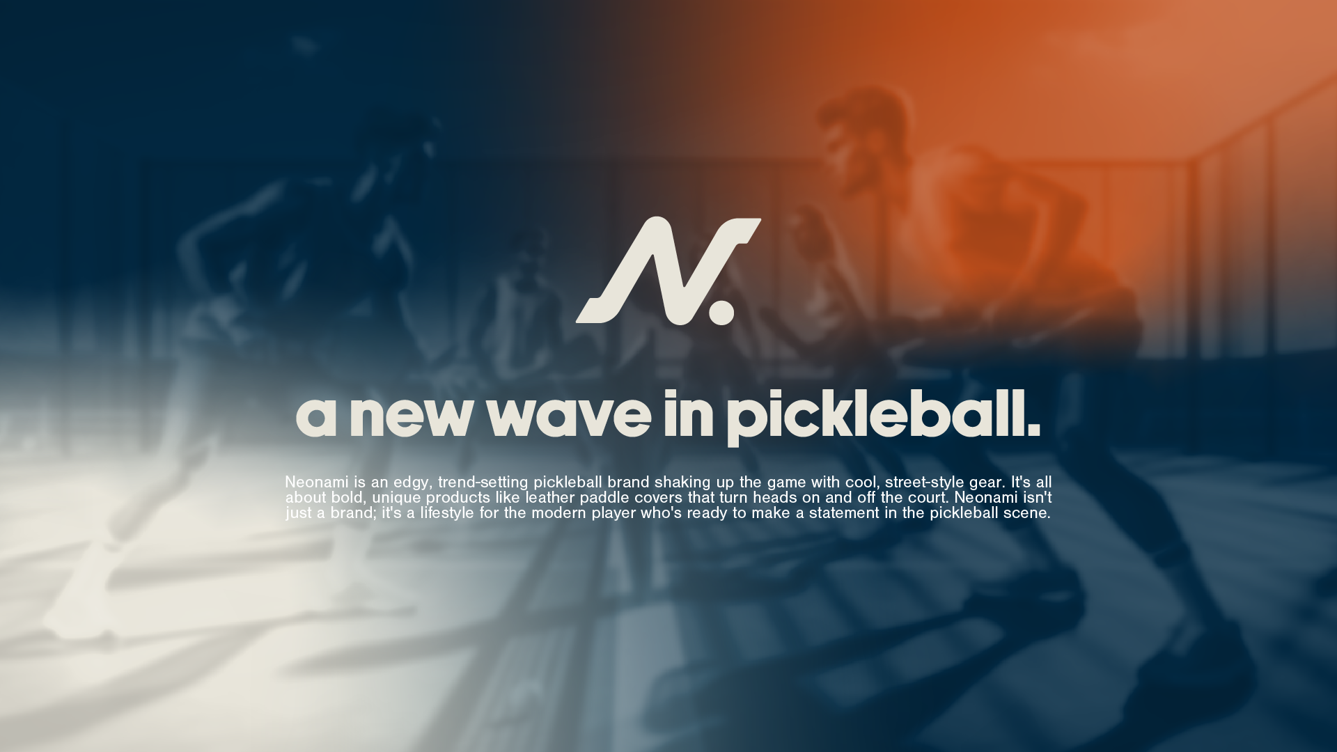
Pickleball blew up faster than its gear caught up, and most of what's on the court still looks like it came off a sporting goods clearance rack. Neonami set out to be the brand for players who care what they carry: leather paddle covers and street style gear that turn heads on the court and off it. That only works if the brand looks the part before anyone touches the product.
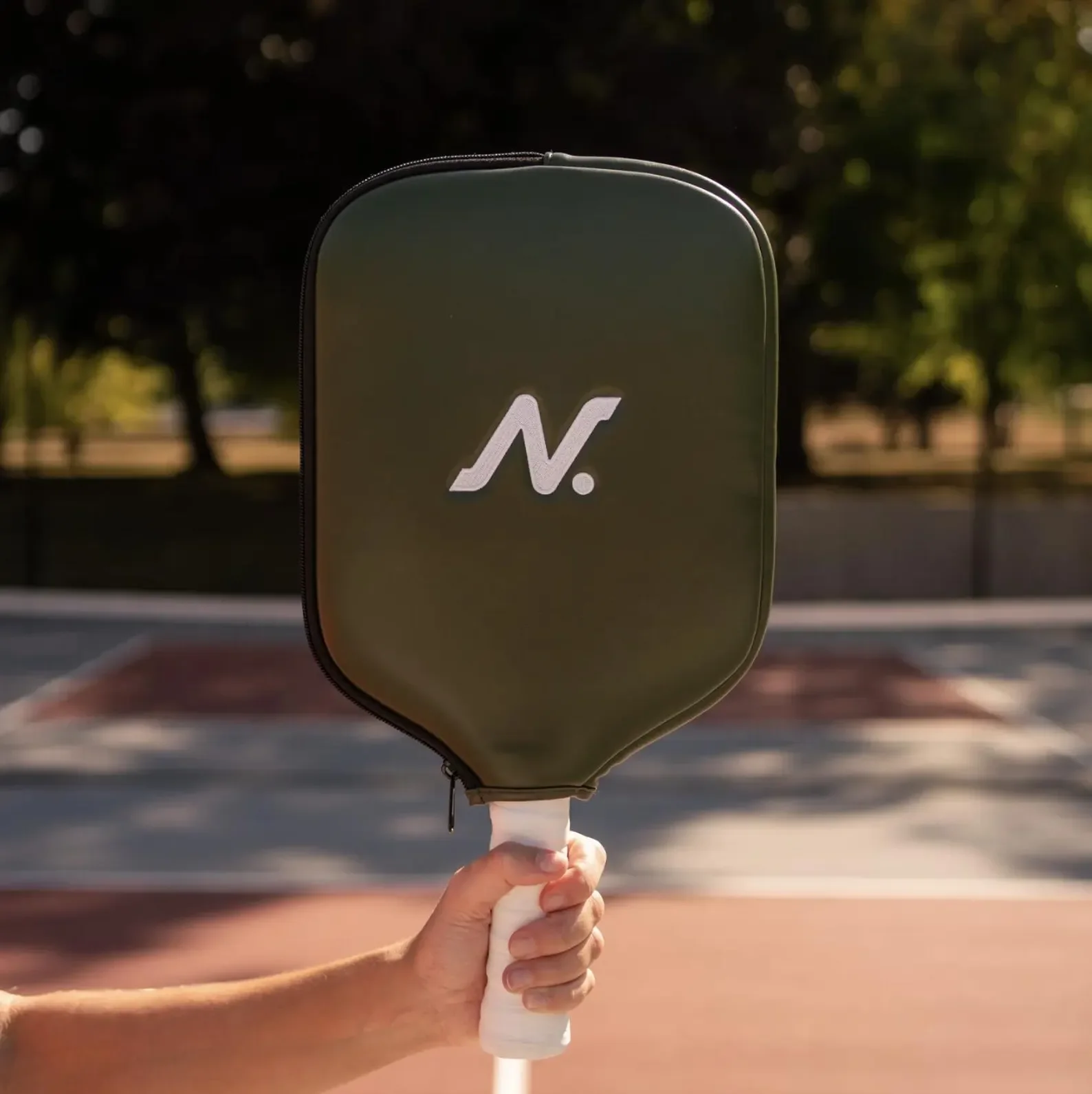
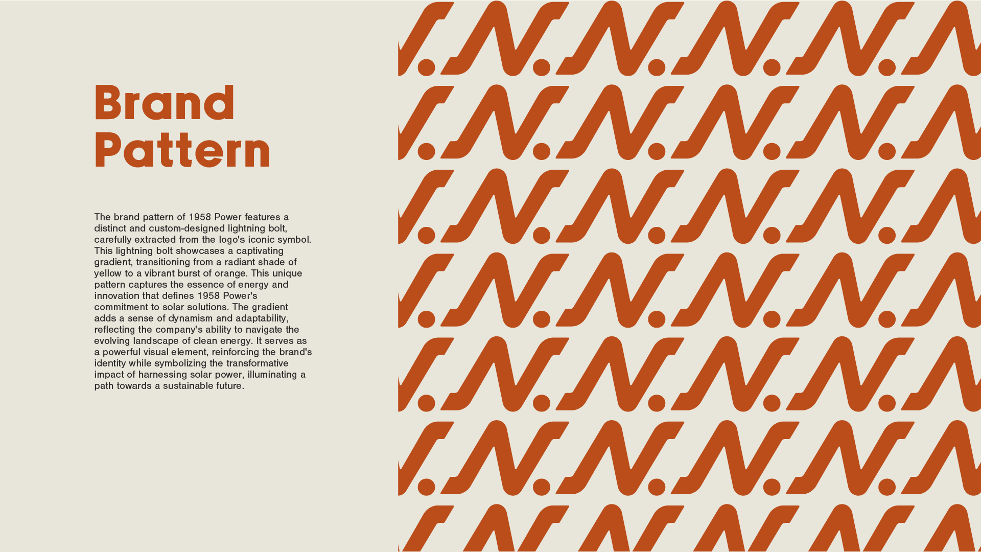
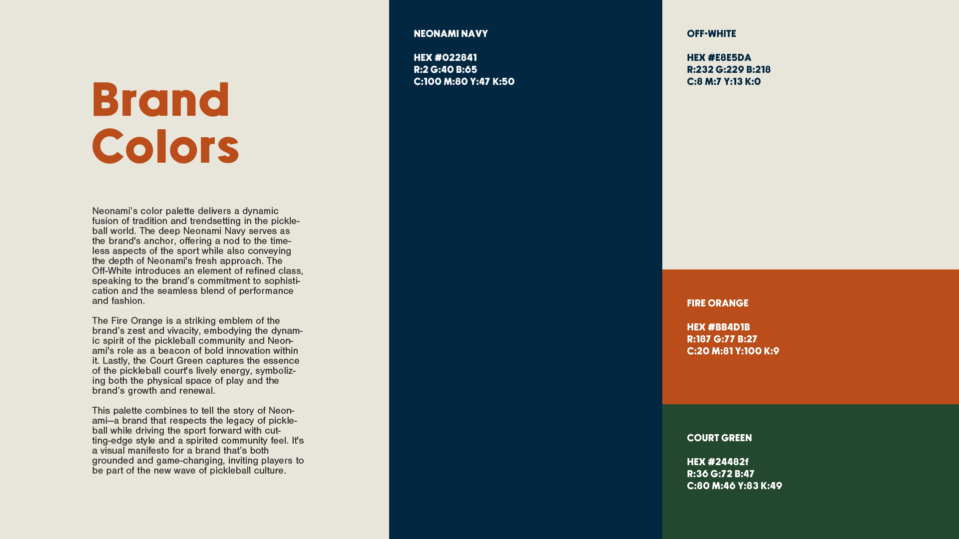
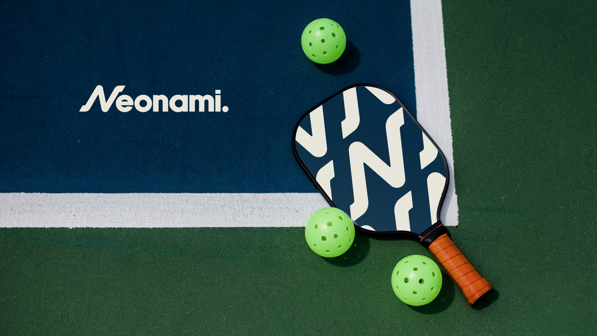
The name blends neo, new, with nami, Japanese for wave. So the whole identity rides on one letter: an N drawn as a wave and finished with a period. It stands alone as the monogram, repeats into the brand pattern, and sits right on the paddle face. Navy, fire orange, court green and off white keep it premium without losing the energy.
THE RESULT: one letterform doing the work of an entire system, from the wordmark to the pattern to the product itself.
Services:
LOGO DESIGN
CUSTOM MONOGRAM
VISUAL IDENTITY
BRAND PATTERN
COLOR SYSTEM
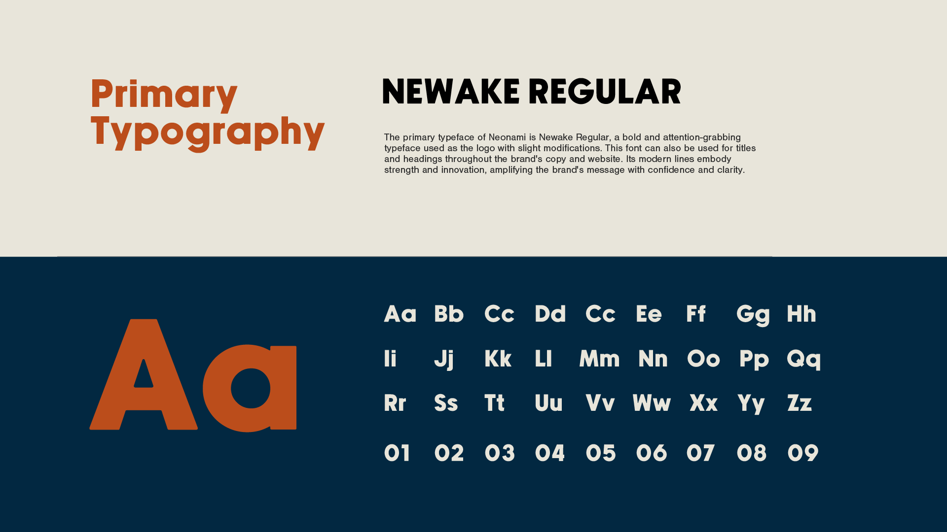
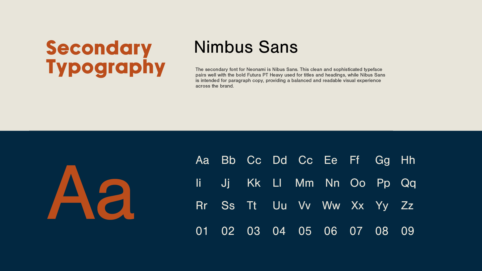
TYPOGRAPHY
PADDLE & PRODUCT DESIGN
APPAREL